
Monday, 28 February 2011


Sunday, 27 February 2011
UPDATE!
Following the construction of our Production Company we have been editing our film:
So far we have inserted the green certificate at the beginning and the Production company. We then inserted a clip which is our establishing shot.
Provides the beginning of a story for the audience, an image for the audiences head and an immediate expectation of what kind of genre the trailer could be due to the eerie, haunted impression the house gives.

We then added in text which we forgot to include on our storyboard which reads:
'YOU CAN NEVER BE SURE'
We then inserted our point of view clip of the camera looking over the wardrobe behind china dolls and watching the victim:

We then inserted more text which the cut to the main character being on the phone:

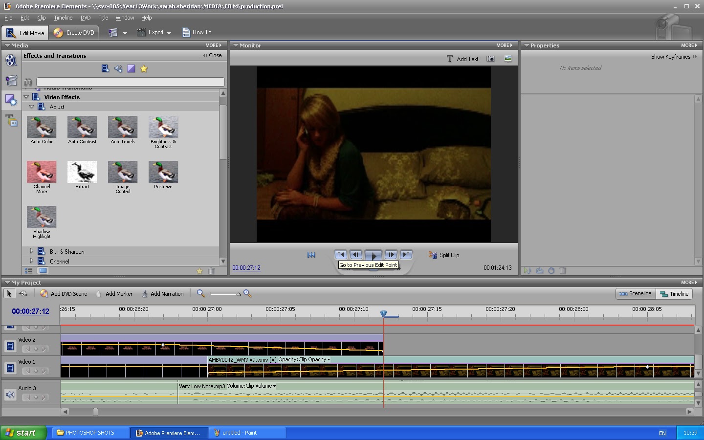
We did however change things about our storyboard when in production as we felt that what we were putting together fitted better and looked more effective.
After adding in the scene where our main character is on the phone and the ghost girl is first seen coming out of the wardrobe, we added more text:

As you can see the next piece of text read, 'following your every move'. This was then followed by the mirror scene where the ghost girl is then standing behind outside the window. This scene was followed by a succession of fast cuts which consisted of the clips and a white flashes which were achieved by inserted a white image and cutting down the play time to 1 second.

After this the fast cuts stopped and were followed by the main character (Alex) screaming behind the wardrobe and banging a china doll. A clip of the ghost girl then followed which merged into the title 'The Wraith' followed by 'Coming Soon'


SOUND:
Sound was then added after we had completed the editing of our footage.
We trawled through the internet in order to find copyright free music we could use for our trailer. The first we found was one called incomputech.

Through this website we were able to look for eerie music that would fit our trailer. You could browse by genre so we clicked horror to see what was on there.
Me and Alex found a sound clip called very 'very low note'
After hearing this we decided this would be effective to use at the beginning when we give our establishing shot.
After inserted and played, we decided that this would be a lot more effective if used throughout the entire trailer.

After having a long look on this website we couldn't find anymore sound we thought would be effective enough for our trailer. Long deliberation we decided upon using a popular Children's rhyme as well as the low note to open our trailer.
We found a website called 'Free Sound Project' in which we found suitable sound that give a very spine chilling feel.


This is how the website looked.
We also found other sounds on there like loud banging which we used for the succession of fast cuts and laughing for our production company.
Amongst using copyright free music, we also recorded short dialogue (for when Alex was on the phone) and heavy breathing which was used for the point of view scene on top of the wardrobe.
Wednesday, 26 January 2011
CONSTRUCTION AND FINAL POSTER
I have finally started the making of my movie poster, first I took photos of which I put my camera on self timer and took photos of, like for my magazine, myself.
These are what i came up with:


These are what i came up with:


This photo is what I thought could be most effective and one I could play with the most:
Using photoshop I edited this poster completely, adding fonts neccesary.
Firstly I changed the image to black and white, then added different shades of red blood splatter under the feet as this was conventional of the horror genre.
I added text over the blood splatter that I created in photoshop, using text that I downloaded for photoshop called 'Trajan Pro'. I edited the text by rasterizing and blurring it to give a ghostly feel.
This was my first outcome:

I achieved the main image by merging these 3 images together:
I took the idea of having the doll and dress visible like in this picture, however I didn't like the quality of this image. As the skirt which was still visible and of a high quality in this I decided to cut it out, paste and adjust to fit the image below.
I also used this image of my hand holding the doll for the top of the main image. After resizing it and adding shadows around the picture both the skirt and doll looked as though they were part of an original photo.
I wasn't quite happy with my first poster so after tweaking parts, it then looked like this:
I thought making the due date bigger and everything below the title centred made it more eye catching to the audience.
Tuesday, 25 January 2011
ANALYSIS OF POSTER

Here I have looked at the film poster that was chosen to be the favourite by my audience. I feel this will help me making my poster.
Monday, 24 January 2011
QUESTIONNAIRE ANALYSIS
RESULTS
FILM Poster Questionnaire
Male 10 Female 10
16-18 9 18+ 11
What area of the poster attracts you to it the most?
What film is featured 6
The main image 12
Text 1
Released date 1
Which of these do you think is most effective?

13

2

3
What makes a film poster most effective?
The main image 14
Text 5
The colours 1
Subscribe to:
Posts (Atom)