Blog Archive

Tuesday, 18 January 2011

CODES AND CONVENTIONS OF POSTERS

Now that my magazine poster is complete I have now decided to complete my other ancillary task of producing a film poster:

I first researched into different film posters of the horror genre that were currently out there:


First of all, I noticed the reccuring theme of darkness used within horror film posters which represents the evil of the character and creates a sense of mystery
I have also noticed that the text within nearly all is white to contrast against the dark background, however there is an element of a dark red colour used for some text this is related back to blood which is prominent throughout the film of a horror genre.
Also within all these posters featured the main character is the focal point whether it being the victim or the 'predator'.
Whilst creating my film poster I shall try to challenge some of these conventions.

Friday, 14 January 2011

FINAL MAGAZINE COVER

UPDATE FOR MAGAZINE COVER:

I edited two pictures as a basis for my magazine cover so that I could build fonts ontop and around it.


I then decided to produce a third image so that I had an array to choose from, after editing my last image I decided this would be suitable enough to use as the main image for my front cover:


I created this using again photoshop. On this image I added the blood splatter lower as I had a good visual image of where I would insert my text. As I believed this would be a suitable image to use, I also decided to add my mast head to the top (again using photoshop)
I used photoshop to create most of my magazine as it is a higher quality tool than using publisher and acheives a higher quality image.

I then transferred my image into publisher where I would add my fonts and layering.
I used dafont.com as a resource for some fonts:

                                                                        -    'Postinkantaka Job'


                                                   -      'All over again'

These fonts come standard in black and white.
If I wanted the font to be white with a black outline I took it into paint and inverted the colours:


I wanted my magazine to look professional so I decided to layer text ontop of boxes etc.
This is what my product looks like:


And after some final tweaking this is my FINAL PRODUCT:


I am very pleased with my magazine cover and will look into it in more detail for my EVALUATION.

PHANTOM PRODUCTIONS

Here are the pictures I edited for my production company so that I could add them all together to make the picture move when it plays:


I edited all of these using Photoshop, it enabled me to change the width, height and angle of the mouths successfully with the 'lassoo' tool:

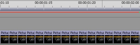
 I then added all my images to Adobe Premiere Elements in order to be edited into really short clips so that they would play really fast and give the effect of the image laughing:


As you can see I repeated my images going from what was labelled ‘picture 1’ up to ‘picture 5’ then back down to ‘picture 1’. All of these were cut down to clips that lasted about a second
I then kept the last image running longer so that I could gentely fade text into it:

This image here shows how the text faded in.


My editing for my production company was finally complete.

DURING THIS TIME I AM ALSO CONTINUING WITH THE PRODUCTION OF MY FILM MAGAZINE

Wednesday, 12 January 2011

MAGAZINE DRAFTS

I have been producing my film magazine using adobe photoshop at home over the past week.
I took photos of myself in the nightdress and make up, I tried different pictures and at first I found it difficult to think of any creative ideas on how to lay it out.
I can never actually start the production of a magazine without a photo to work from, as I then find appropraite fonts and set the layout around it, therefore I had to ensure I had the perfect picture.
Here are some pictures I took and thought about using however I discarded of them because I thought they weren't of high quality:


As these photos weren't taken at the time of the filming, I had to try and recreate the make up however certain things that were avaliable at the time of filming, weren't when I came to take my photos therefore I had to use substitutes e.g. Talcum powder for my face instead of white foundation.
After these photos I decided to take a different approach and instead of taking a photo of myself in a medium shot, I would try sitting down and using a self timer to capture the right shot.
Here is a photo I took which I then edited in photoshop:


I added the blood splatter into the background as I liked the effect and created a sense of danger and horror. I also made the background darker than myself as it made me stand out more.
I will keep posted my updates of the magazine cover.

Friday, 7 January 2011

EDITING SOFTWARE

Looking at ADOBE PREMIERE ELEMENTS:
 
 This is the programme we will be using to edit our trailer.

 From looking around on the software I will find these effects to be the most effective: 

AUTO CONTRAST – This will be used  to automatically highlight and darken my footage so that it wil look clearer and sharper.

AUTO LEVELS – This will adjust the colour quality of our footage so everything will be a richer colour and look more natural.


These are the transistions I will find most effective for our trailer:

Dip to black– This was used  as a transition between cuts as it faded one out and faded into another smoothly 

Wednesday, 5 January 2011

OUR OWN PRODUCTION COMPANY

Production Company:
After doing my research on production companies, my group and myself began to plan a draft of our own. We originally decided we were going to call it scorpio productions however we felt that it didn't relate to our trailer very well so decided on a different design and name which we are all now extremely pleased with.

Here is our draft:


This was made on publisher with an image found off google, we decided on phantom productions because after searching the meaning of phantom in dictionary.com we thought this suitable:

phan·tom

[fan-tuh m]

–noun
1.
an apparition or specter.
2.
an appearance or illusion without material substance, as a dream image, mirage, or optical illusion.
3.
a person or thing of merely illusory power, status, efficacy, etc.: the phantom of fear.


I then decided to edit it a little to see how I could adapt it, I inverted the colours in paint to see what looked better:


My group and I were undecided which to use however we have planned to decided nearer to the time it comes to editing, I have been given the task of drawing the image out so it becomes more personalized to ourselves.
Here is the finished drawing which I then scanned into the computer:

In Photoshop I then edited the mouth 6 different times so that I could animate it so the mask smiling is laughing. I will then edit this is Adobe Premier and adding text I will animate it into a proper production company.

Sunday, 12 December 2010

PROBLEMS IN FILMING

During the production of our trailer, we came across certain problems whilst filming.

These problems included:

-   The camera had trouble picking up features in dark areas, because the camera we were using didn't have night vision we found it very hard to create the effect we wanted. Here is an example of when we wanted the room to be very dark to give the effect that she was asleep in bed at night and something was watching her from over the wardrobe. This would be one of our first scenes in the trailer so we need it to be good.


-   We also had a major problem with lighting, because the camera we were using didn't produce very good quality film in the dark, we had to use alot of lighting so the camera would see the characters. However we had to put lighting very close to the characters we wanted to highlight or have very strong lighting, unfortunately this doesn't look very realistic when the character is supposed to be asleep and theres a strong light hitting her.


-   The tri-pod we were provided with was brand new, because of this the movement was very stiff which made our filming very jerky. This was very annoying and meant we had to re-record parts of our filming.
Here is where we had a problem with this:

(CLIP/IMAGE HERE)

-   Re-recording. This took up ALOT of our time, main reasons why we had to do this was because we either had problems with using the camera, the camera wasn't picking up the characters, there wasn't enough lighting or there was very bad acting! 


-   Poor acting, because we aren't actresses and none of us do drama I wouldn't say we were the best actresses. We would always end up laughing because we couldn't take ourselves seriously or were just really embarrassed; however once we were focused on the task we acted a lot better.